Pages

Wednesday 7 April 2021

IELTS Writing Task 1- Sample 5 (Model Answer with guidelines).

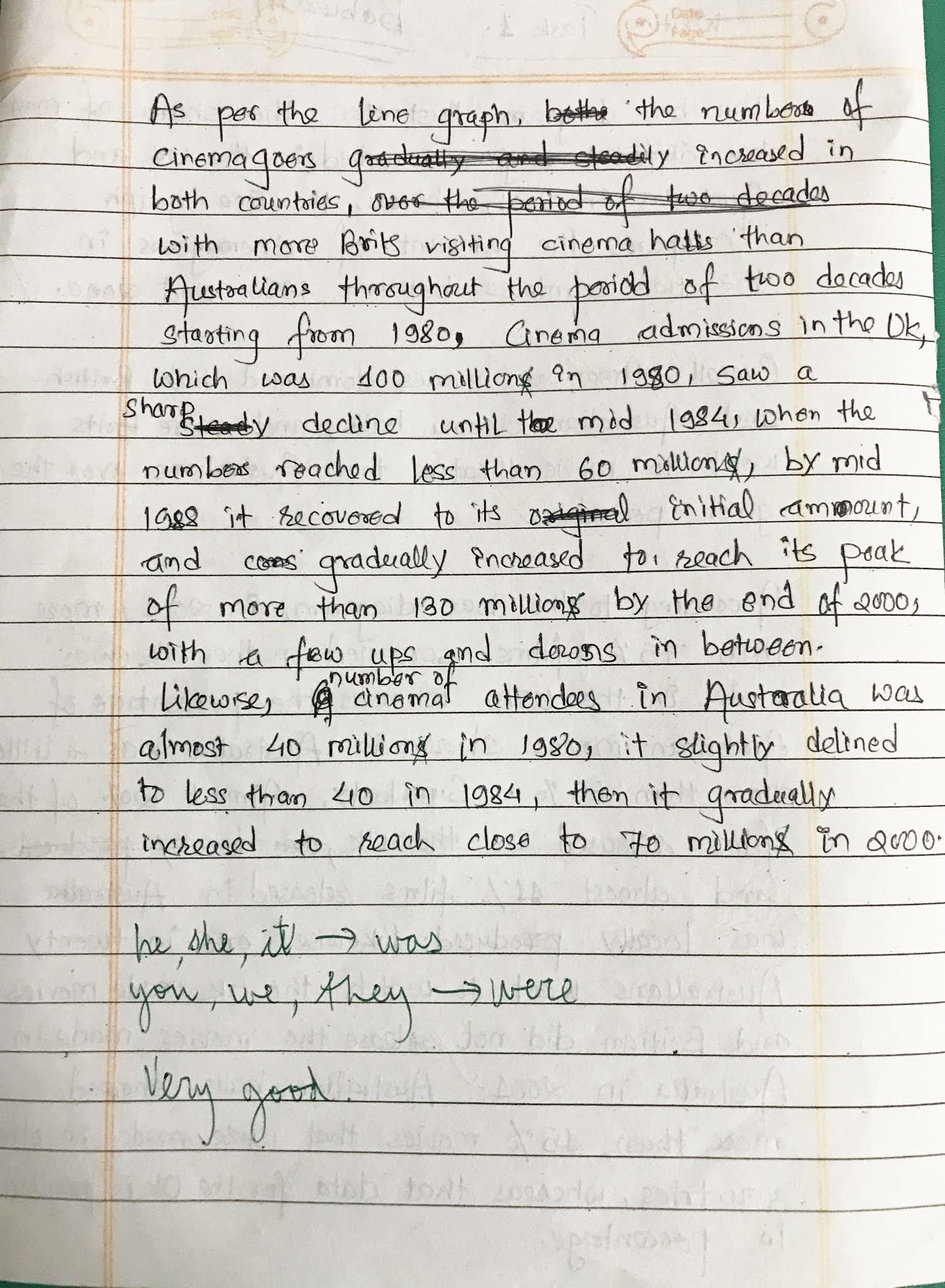
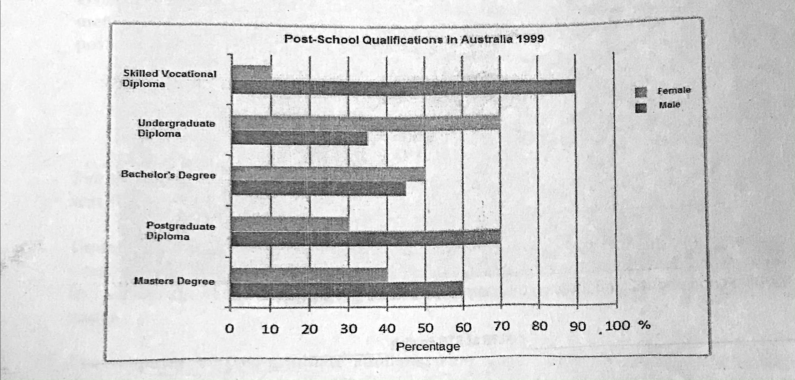
The chart below shows the different levels of post-school qualifications in Australia and the proportion of men and women who held them in 1999.

Summarise the information by selecting and reporting the main features, and make comparison where relevant. Write at least 150 words.


This is the model answer provided by teacher at RTC ENGLISH with guidelines.

  1.  Re-Write / rephrase the title/task (try to make it simpler and more straightforward.
    The bar chart compares the levels of qualifications that are available in Australia after school and the percentages of male and female students who studied for those qualifications in 1999.

  2. Identify the main points described by the data ( look for a pattern in the data and describe it).
    Overall, men obtained more qualifications than females. In addition, more women than men studied at the undergraduate level and a far higher proportion of men obtained post-graduate level credentials.

  3. Describe the data in a clear and organised way (are you describing change or difference - in this case a difference but in the past tense).
    Far more males studied for a vocational diploma, 90%, while only one in ten students was female, 10%.
    Undergraduate diplomas and degrees were more popular with women. Twice as many women, over 70%, studied for an undergraduate diploma than men. The difference was less significant at the degree level, where over 50% were female and just below 50% for males.

    The majority of post-graduate students were men. 70% of post-graduate diploma students were male, more than twice as many as women, and 60% of Master's degree students were men and 40% were female.

  4. Write at least 150 words.
    152 words

IELTS Writing Task 1- Sample 4

The graph shows typical levels in enthusiasm, confidence and ability of students attending a ten-week IELTS course. Write a report for a university lecturer describing the information shown below.

Here's my answer with teacher's feedback.


IELTS Writing Task 1 - Sample 3

The graph below compares figures for the production and consumption of energy in the US from 1950 to 2013. It also predicts figures to 2023.

Describe the information in the graph, comparing and contrasting production and consumption levels.

You should write at least 150 words.

Here is my sample answer. I have forgotten to mention imports, which will reduce score in the real rest. Also, I have not divided the main body into paragraphs, which I should correct.


Another sample from a Nepalese student (corrected version)

The graph shows the changes in the amount of energy produced and consumed in the US since 1950 and projects trends until 2025.

Both the production and consumption of energy has been increasing. The gap is projected to be wider in the future, as we can see that consumption is consistently higher than energy produced in US (should be: in the US) . The deficit of energy is compensated by the imports ( by imports : do not use the).

In 1950, US (the US) produced 25 units of energy which has now increased to around 70 units in the year 2013. The energy production is anticipated to increase steadily to 90 units in 2025. It showed fluctuation for a small period time (period of time) in the years following 1975.

On the other hand, consumption of energy was above 25 units in the starting year. Since then, the consumption has been increasing consistently until the present year (add: reaching just below 100 units). In the following years, the demand is expected to rise sharply and by 2025, 140 units of energy is expected (are expected) to be consumed in US (the US).

(Uncorrected 165 words, corrected 173 words)

IELTS Writing Task 1- Sample 2

 Here's another sample answer with teacher's feedback. Please note that you can only spend 20 minutes on this task, so plan accordingly.

WRITING TASK 1 

The charts show the share of the Australian and British cinema markets in 2001 and cinema admissions in Britain and Australia from 1980 to 2001. Write a report for a university lecturer describing the information. You should write at least 150 words.


Related posts